Client Project-Farmhouse Entry and Dining Room

Hello, hello!  Summer is officially here (as in school is out for our kiddos), and we have been working hard on a few projects before the chaos ensues (hopefully not).  So we wanted to drop in and share a few new designs with you!

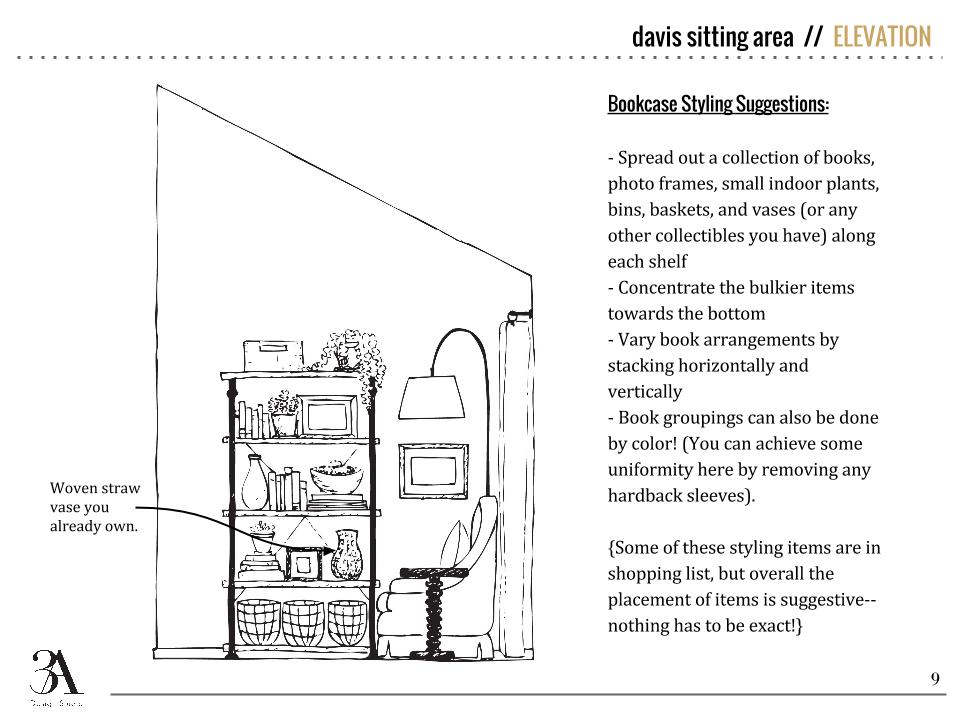
Today's design is for an entry/dining/sitting area that opens up to the clients' large kitchen.  It's a big space with pine wood clad walls and a stone-covered hearth. 

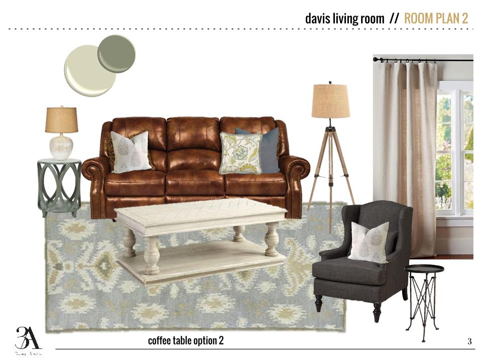
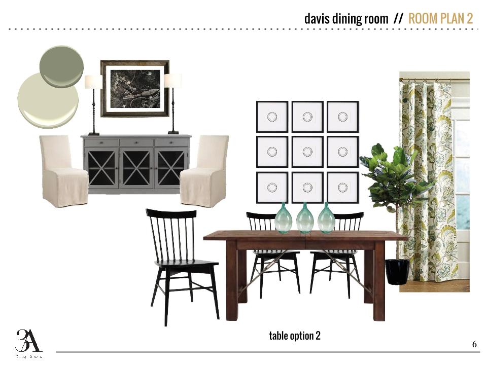
Because this space will function as multiple things on multiple occasions, we kept the pieces classic and timeless but with a touch of "farm."  The kitchen cabinets will be painted in White Dove by Benjamin Moore, one of our favorite white cabinet colors, and the rest of the color scheme is neutral with touches of blue and green.  Of course, we also brought in lots of texture!

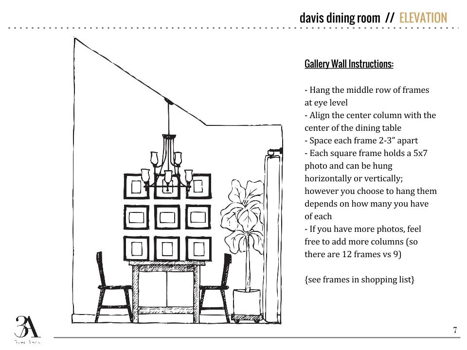
As you can see, we offered two options for the dining room seating and suggested slipcovers since the clients have kiddos themselves.  Aside from the wood bead Regina Andrew chandelier, the lamps on the entry table and rope hanging mirror are two of my personal favorites in the space.  I think I could put those Visual Comfort Thomas O'Brien lamps in every design I do and be happy.

Lighting is one of the largest ways to transform a space, and since the chandelier we suggested was a big buy, we also supplied some real life images of it so the clients could get a better idea of its look before pulling the trigger.  Even though this is an E-Design, we still want clients to feel as if they are out shopping with us!

So there's a little peek into our latest work and our process!  We'll be back soon with some more client designs to share with you guys!

Client Project - A Farmhouse E-Design

We wrapped up a huge great room design in a beautiful Alabama farmhouse last month and have been dying to share it with you guys.  Dana previewed a little tease of it here, but today we’re showing you the rest.

Our sweet clients had just moved into their new home a couple of weeks before we went for the consultation.  We had seen some photos of the house through email but we couldn’t really get a grasp of its openness and amazing views of their man-made lake and 3 acres below.

Look at that view.  (pardon the boxes and such...they had just moved in)

View standing in the living room and looking back into the kitchen.  Don't you just love all of the openness?

Our clients told us they liked cool, soothing colors and wanted a design that would work with the aesthetic of the farmhouse and also be comfortable and durable for their young family.

We got to work by first selecting new paint colors for the walls and built-ins and then sent over some sofa options.  Due to a long wait time on a custom sofa, the clients ultimately had to select one in town that fit their needs.  We still got to “go shopping” with them virtually and added their newly selected sofa and loveseat to the design foundation.  As you can see below, we also presented them with a couple of options for a coffee table as well.

The entry is right off of the living room so we brought some of the rustic elements and the same color palette to this side of the room.

n the dining room we suggested all new furniture to tie in with the rest of the space.  We chose more colorful window treatments and accessories to bring some life to this side of the room.

We love supplying our clients with not only mood boards and items suggestions but also elevations so they can actually visualize the scale and look of the new pieces in the space.

Directly across from the dining room was an unassigned space where we created a seating area.  The clients had some slipper chairs that they wanted to recover so we supplied fabric and pillow options to complete the look.

BEFORE

BEFORE

Aside from the large great room, we also supplied tile backsplash ideas for the kitchen to be used at a later date and included some suggestions for finishing off their master bedroom. They need bedding suggestions to match their existing duvet and a remedy for covering a mid-height wall outlet.

It was so great to work in a home where we could really tie each room together and supply the homeowners with a look they’ve been hoping to achieve.  We’ve already seen a couple of the progress pictures and can’t wait to see the finished product!

If we can help you finish off a troublesome space (or spaces), please let us know!  Whether it's a few styling suggestions and paint colors or a newly designed room, we can help.  Go here and fill out our design questionnaire at the bottom of the page to begin.

Home Tour: Making the Most of Small Spaces

As our family grows, my husband and I are constantly thinking and re-thinking what the perfect family home would look like for us (this comes naturally to an architect and designer--you should see us at restaurants--no napkin is left without a doodle, and my purse almost always carries a sketchbook if my husband is with me). 

Against our instincts (and probably the instincts of many), it's the small spaces that intrigue us the most. I've featured tiny homes in a post before, and although I don't think that would work for us in our current situation, it's not something we've ruled out for the more distant future. 

Small space living is not something we're accustomed to here. I mean let's face it. Big houses are a status symbol. It's not our natural tendency to "dream of smaller spaces." No one ever said "I wish I had less storage." You get the idea.

So when we see someone pull it off--especially a family of four, like the home of interior designer Jessica Helgerson featured in the Houzz tour below, we take serious note. You may not relate to us. AT ALL. And that's totally understandable. But you have to admit as you scroll through the planning of this house--it's totally genius. The use of space is excellent. You can tell it's small, but none of it feels tight or crowded. Hats off to Jessica!

My favorite room (as I've seen and pinned on Pinterest) is the bunk room. A lot of parents of multiples argue that shared rooms don't work forever because children eventually need privacy. And while these kids aren't exactly teenagers yet, the bunk is designed (as many clever bunks are these days) with a cubby-like feel, so each bunk user is walled-in on three sides. It definitely lends itself to much more than just snoozing.

So take a look for yourself. Even if the small space isn't appealing, you have to admit the design is very well executed. Not a space left un-used.  

What are your thoughts? Could you see yourself living here (with some adjustment, I'm sure)? 

Maybe just as a vacation home? ;) I hope it's at least inspired you to think outside of the ordinary home design!

Until next time!