Trending: Natural Wood Cabinets

For the past few years gray, white, or two-tone cabinets have been all the rage. As we see in fashion, design styles fade for the next up and coming fad.  In this case, enter natural woodcabinets. For the most of us, when we think of natural wood finished cabinets we think of generic builders grade cabinets that have a yellowish varnish to them. However, after seeing the kitchens below you may change your perspective. 

Via

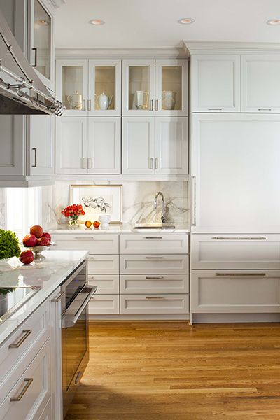
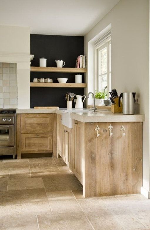
Here is another view of the same kitchen.

Via

Via

Via

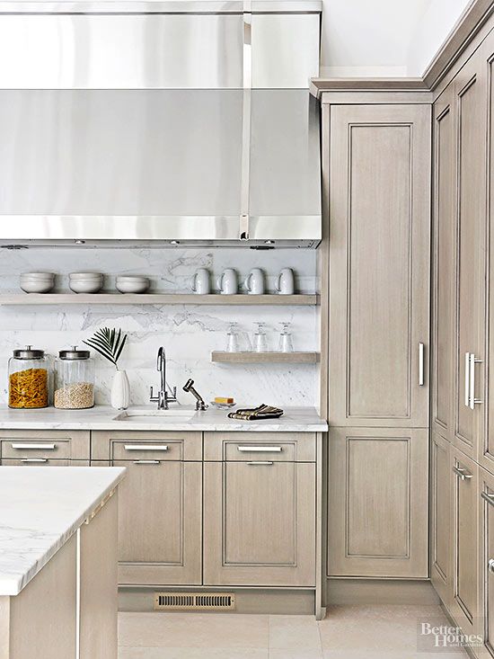
The cabinets above are made from alder wood that have a thin gray stain applied to them, which warms up the cabinets while still letting the grain show through.

Via

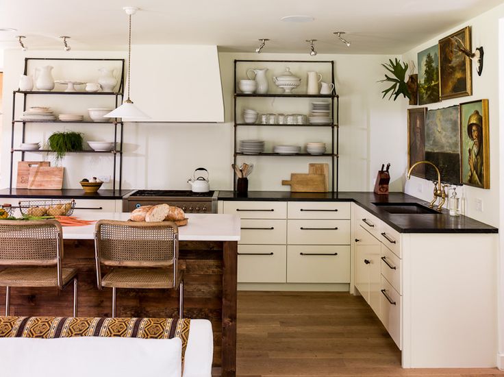
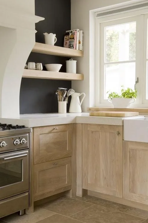
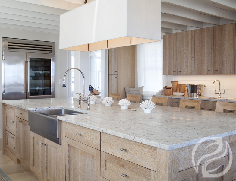
The cabinets featured in the modern kitchen above and in the kitchen below are made from white-oak.

Via
Via

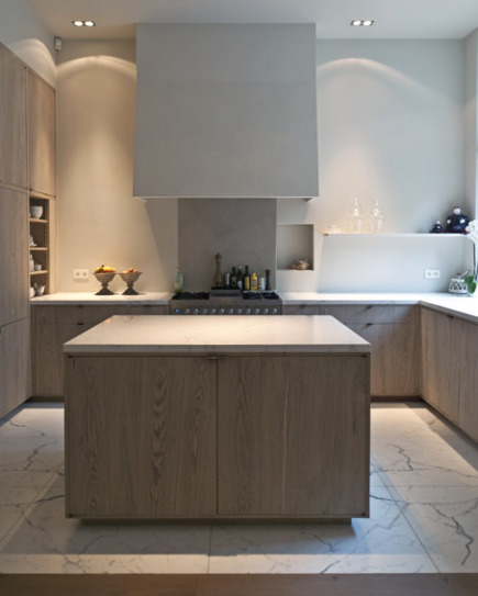
With the right stain/finish, natural cabinets can look sophisticated and add a nice warmth.  As we have seen in the images, works in all kitchen styles from traditional to modern.

Until next time!

the Tale of Two Kitchens

Can you believe September is almost over? It has been a busy month for us. Thought I would share today a project we are currently working on.

Our client is an investor who purchased a modest builder's home in a somewhat conservative neighborhood. With the exception of the master shower, the house has been gutted, so we pretty much have a clean slate to work from.

With an open floor plan, the kitchen will set the tone for the rest of the house. To appeal to a wide group of people, we decided to go with a white kitchen with shaker style cabinets. Here are few images that depict what we had in mind.

In our market granite is still king, so we put together two budget conscious designs, one utilizing granite and another with quartz countertops.

In the first kitchen design, we chose to use a white subway tile for the backsplash. It is both classic and very affordable. To alter the look of the subway tile a bit, we recommended installing it in a herringbone pattern or brick pattern with a contrasting grout. Above the bar we chose a beautiful globe pendant for some eye candy.

*A tip when working with an open floor plan, continue to run the flooring from the great room into the kitchen to make the space appear larger. 

Bristol Park kit1.jpg

For the second kitchen design, we went with darker flooring and fixtures that were more polished. Again, we used a subway tile but in a dark gray glass. The over all look is a little more elegant than the first.

We may replace the wall color with a tinted white.

We may replace the wall color with a tinted white.

Our client liked both kitchens, so he was going to share them with some friends to get a consensus of which one people liked most.

Which kitchen would you go with?

Whether you need full service design or just help selecting a few pieces, we can help. Drop us a line to get started.

Artwork in the Kitchen

One of the most pinned rooms for interiors are kitchens.  It should come as no surprise since it is "the heart of the home" and arguably one of the most used areas for living and entertaining.  Because of this, I think the kitchen needs a little extra attention--mostly in the way of artwork.

Many people shy away or don't even think about having artwork on or over the kitchen counters.  "There's no room for it" they say..."It will get messed up when cooking"..."Are you crazy?"

And I combat those statements with "Yes, there is"..."Not it won't"...and "Definitely not."

Artwork is an excellent way to make your kitchen feel like any other designed space in your home.  It makes the room more personal, is a great talking point and makes a huge difference in the space with little effort.

If you're still weary, let me show you some examples. 

0
false


18 pt
18 pt
0
0

false
false
false


 /* Style Definitions */
table.MsoNormalTable
	{mso-style-name:"Table Normal";
	mso-tstyle-rowband-size:0;
	mso-tstyle-colband-size:0;
	mso-style-noshow:yes;
	mso-style-parent:…

Here's a great example of some little pieces via Lacquered Life.  The picture light makes it even better.

Even without a lot of extra wall space, you can still prop up a small framed piece. (via Decorator's Notebook) 

Even without a lot of extra wall space, you can still prop up a small framed piece. (via Decorator's Notebook

This home was recently featured in Atlanta Homes & Lifestyles, and I may have to give it a full post one day because it is that good.  But, in the meantime, let's enjoy this kitchen. 

This home was recently featured in Atlanta Homes & Lifestyles, and I may have to give it a full post one day because it is that good.  But, in the meantime, let's enjoy this kitchen. 

The wet bar is also a great place to add some art (via Terra Cotta Design).

The wet bar is also a great place to add some art (via Terra Cotta Design).

Lauren Liess has been a design icon for me for awhile, and her previous home's kitchen is a great example why.  Tip: Flea markets and thrift stores are a great place to get vintage oil paintings.

Lauren Liess has been a design icon for me for awhile, and her previous home's kitchen is a great example why.  Tip: Flea markets and thrift stores are a great place to get vintage oil paintings.

Over the stove is another great place to bring in a framed piece. (via The Paper Mulberry)

Over the stove is another great place to bring in a framed piece. (via The Paper Mulberry)

This last one doesn't technically have art, but I love how the leaning wood cutting boards act as a great replacement.  It just goes to show, it doesn't have to be fancy to work! (via The Proper Hunt)

This last one doesn't technically have art, but I love how the leaning wood cutting boards act as a great replacement.  It just goes to show, it doesn't have to be fancy to work! (via The Proper Hunt)

Now go add some art to the heart of your home.  

*Designer tip: Stay away from themed items like pictures of utensils and coffee cups and word art for a more high-end look.

For more inspiration, follow us on PinterestInstagram or subscribe to our posts in the sidebar (or lower bar on your smart phone).

Get the Look - A Norwegian Kitchen

Typically, I am not drawn to rustic designs but this beautiful kitchen located in Norway is an exception.  Something about this kitchen has me envisioning rolling out dough for home-baked bread, which I have no idea how to do nor would typically enjoy. Perhaps it is the combination of several elements: the natural light that floods the room, the tall ceilings and wooden beams, the fireplace next to the farm table, the juxtaposition of the contemporary white cabinets against the natural woods, the basket pendants, and the global accents. Alluring, no?

The greenery against the muted color palette looks so vibrant and beautifully injects color into the space.

bohemian kitchen 2.jpg

Inspired? Well, you can re-create the look with these elements.

leather chair // gray paint // basket pendant // tree // rug // elbow chair // table

Feeling crafty? Here is an easy DIY to create your own basket pendant for a lot less.

Until next time, XOXO.

Condo Refresh

With summer vacation days coming to a close, condo owners are assessing their rentals and looking to refresh their properties to get more bang for their buck next year.  I don't know about you, but one of the main things I look at when renting a condo (next to location) is the style of the place.  If you're going away, you'd like it to be a place you want to relax, right?  A place you want to spend time.  A place to make you feel like you're on a vacation.  

A few design updates can go a long way when sprucing up a condo.  And thinking outside of the coastal cookie cutter box can make your condo stand out among the rest of the competition. 

Here a condo E-Design we recently completed.  They didn't need a full overhaul-just a little refresh, and we were more than happy to oblige.

With a great neutral backdrop to start, all we had to do was add in a few new pieces to bring this place back to life.  We suggested updating the kitchen with a new backsplash in these coastal blue arabesque tiles and replacing the existing can lights over the bar with these antique nickel pendants.  Finishing off the updated kitchen, we suggested using these modern, easy to clean acrylic bar stools in lieu of the dated wooden ones they had.

In the living area we added in a durable seagrass rug one size larger than their existing one (scale is huge), brought in some new pillows for their existing slipcovered sofa and added some blue lamps.  The blue color and acrylic base of the lamps tie into the tile and barstools in the adjoining kitchen, and the fabric on the pillows (great for camouflaging stains) has a coral inspired look with a slightly unexpected color palette. Update complete!

If you're looking to update your condo or rental, here are a few things to consider giving a "refresh"--

  • lighting
  • pillows
  • wall paint colors
  • hardware
  • backsplash
  • rugs

And if you have no idea where to start, contact us and read more about our E-Design process here.  We'd love to help!


Client Design: A Modern Classic Kitchen

We recently had a client contact us about helping them update their kitchen.  The couple didn't want to do a huge renovation or overhaul, just some ideas they could easily implement to give their kitchen a facelift.  Lucky for them, our E-Design process was perfect for such a task!

Lucky for us, they already had great bones to work with--an island, shaker style cabinets, a built-in banquette. They had also recently purchased these modern barstools and they wanted to know how to incorporate them into a more traditional style like the rest of their home.

We loved the clean lines of the stools and were excited to get to work marrying traditional pieces with some modern touches.  Here is what we designed.

The lights over the island are a much cheaper version to Troy Lighting's Maidstone.  It was a great fit for a beautiful style on a budget and wasn't too ornate for some modern pairings.  We suggested updating painting their cherry cabinets in Silvermist (SW-7621) and adding this brass hardware for more clean, modern lines.  A good rule of thumb for hardware is pulls on the drawers and knobs on the doors.

schoolhouse electric brass hardware

For the countertop we suggested this beautiful Torquay Quartz by Cambria.  This was the biggest item in the budget, but it will last forever.  It has the look of marble but with much less maintenance.  They didn't have a backsplash before but were interested in adding one if they could find something in their budget--enter white subway tile.  It's a timeless classic (that's why you see it everywhere), but it's also very affordable. 

For the banquette area we wanted to add in some fun color and pattern with these pillows in a fabric by Kravet.  They add a playfulness to the space and soften the banquette which was previously just a wooden bench.  We topped off the banquette update with this high-gloss, oversized cone pendant light with gold lining inside to add the perfect glow for conversation.

oversized cone shade pendant

We love how this kitchen turned out, and even better, so did the client!  Kitchens are some of the easiest spaces to update with paint, hardware and lighting.  If we can help you spruce up your space, contact us here.